Web Design and Usability
Nick Thompson
Steam
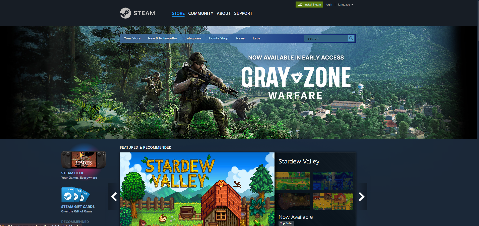
Valve's Steam store simplifies the navigation, uses minimal text, and uses 'show don't tell'. The logo is very recognizeable.
GOG
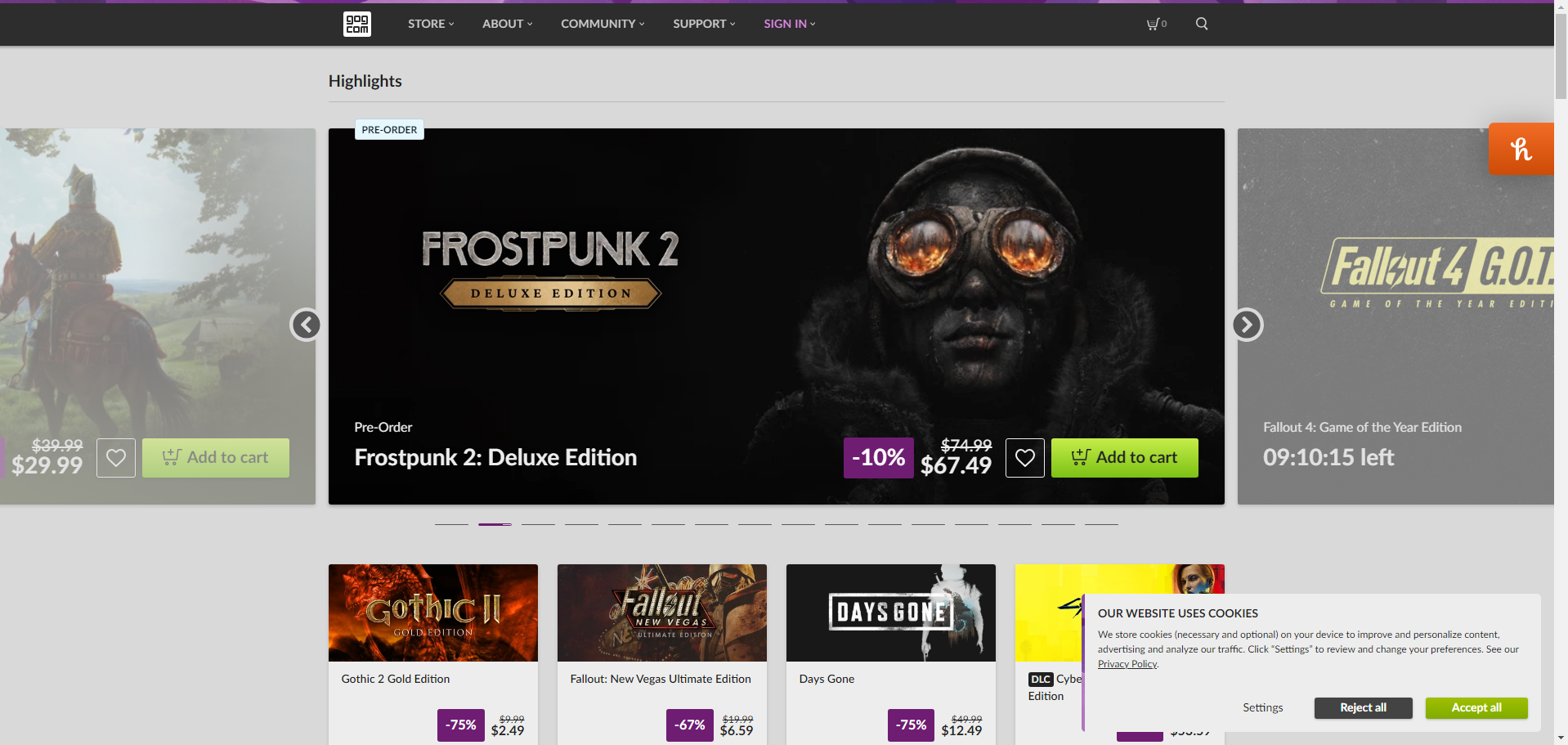
GOG utilizes similar method to Steam, although they display a little more information for the games displayed at the top of the screen, regarding price.
Personally, I think GOG's design is more pleasant.
Usability/Design Characteristics
- Minimize Text
- Don't bombard users with a wall of information. Make text clear, and concise. Help the user get the information they need in a short time. Steam and GOG both avoid including a lot of text to describe games.
- Clear Call to Action
- In order to convert visitors of your site to customers or returning users, provide them with an easy way to do so. A large button that is eye-catching and enticing, for example. If the user can't find where to go to access what you offer, they may not return. GOG makes it very clear that you can add a game to your cart; Steam does not make it as obvious to someone who has not used their site before.
- Show, Don't Tell
- Use images to convey information. Pictures can relate things faster than reading in many cases. If you're selling a car, an image of a car does more than words about the car. Images can also help appeal to emotion. Both GOG and Steam use images for games to attract attention to them. GOG uses a gallery so different images scroll over time.
- Simplify the Navigation
- In combination with minimal text, simplifying navigation also helps users find what they're looking for. Too many navigation links can make it difficult to get around. Both sites have their navigation at the top of the page, easy to access.
- Optimize for Mobile
- A vast portion of the world uses a mobile device to access the internet. It's important to cater to the design of mobile devices, and make your site responsive to their screens and not just the wide displays of a laptop or desktop computer. Steam and GOG both have responsive sites that display well on a phone, and navigation still remains easy.
- Choose a Color Scheme
- It's important to pick a color scheme that matches your existing brand. It also needs to be pleasing to the eye. Pay attention the contrast of different colors. They can drastically affect the readability of a website. While Steam's color is recognizeable to existing users, the simple blue doesn't really pop. GOG's design much better uses contrast of a light background against the thumbnails for games to create an interesting look.
Suggestions
- I think Steam's layout could be tidied up. GOG's design flows much better, and you can add a game to your cart without first having to go to the game's page.
- GOG's navigation could stand to make it so you can sort games by category from the front page. Steam, while not as pretty, makes it easy to go to different genres.
- Steam uses a solitary hero image at the top of the page to advertise, and then a gallery below it. I think the design would look and flow better with just a gallery to showcase games.
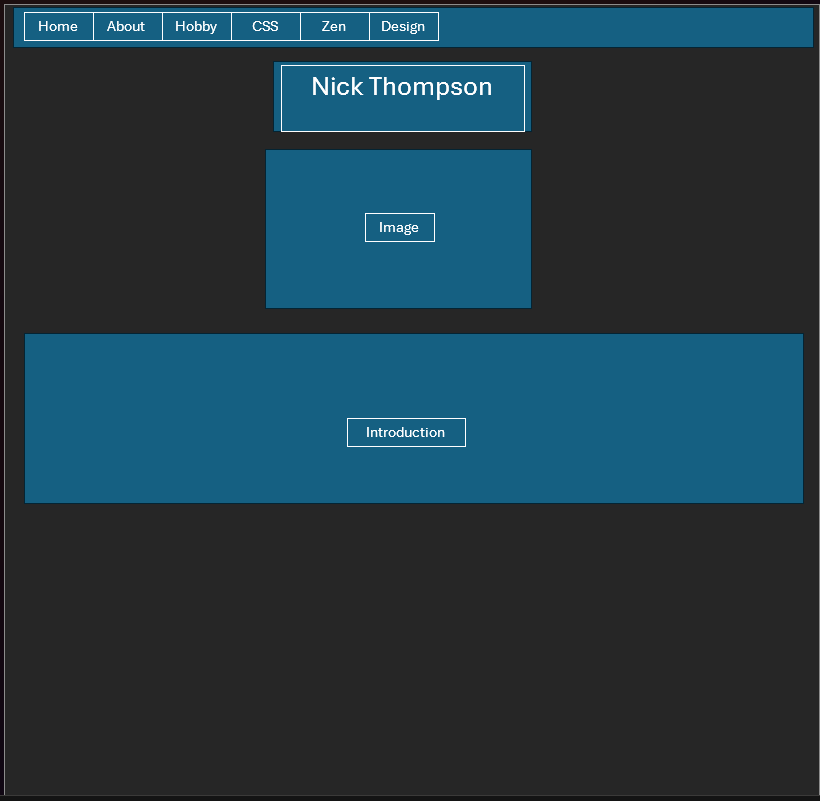
Index.html Wireframe
A Wireframe of my current index.html. It's still very simple.
A color palette I'd like to use.
